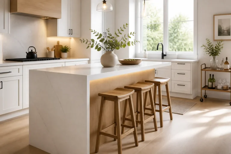
You want rooms that look pulled together without endless second-guessing, right? These six foolproof color schemes nail it every time, from cozy neutrals to bold jewel boxes. Each one comes with specific furniture, fabrics, and finishes so you can copy the look with zero stress. Ready to make your spaces dangerously photogenic?
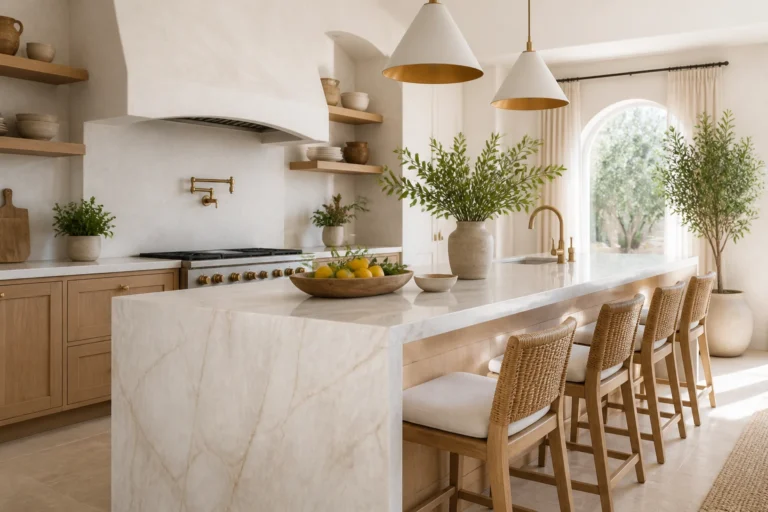
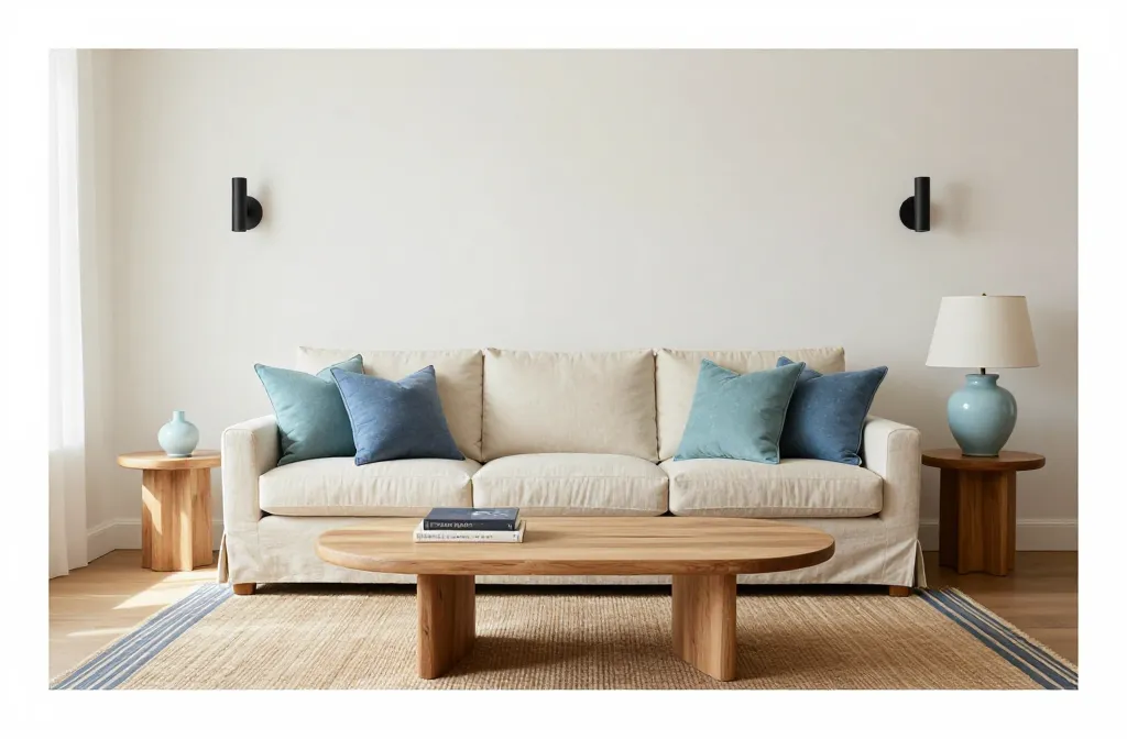
1. Coastal Calm With Sand, Soft White, and Sea Glass Blues
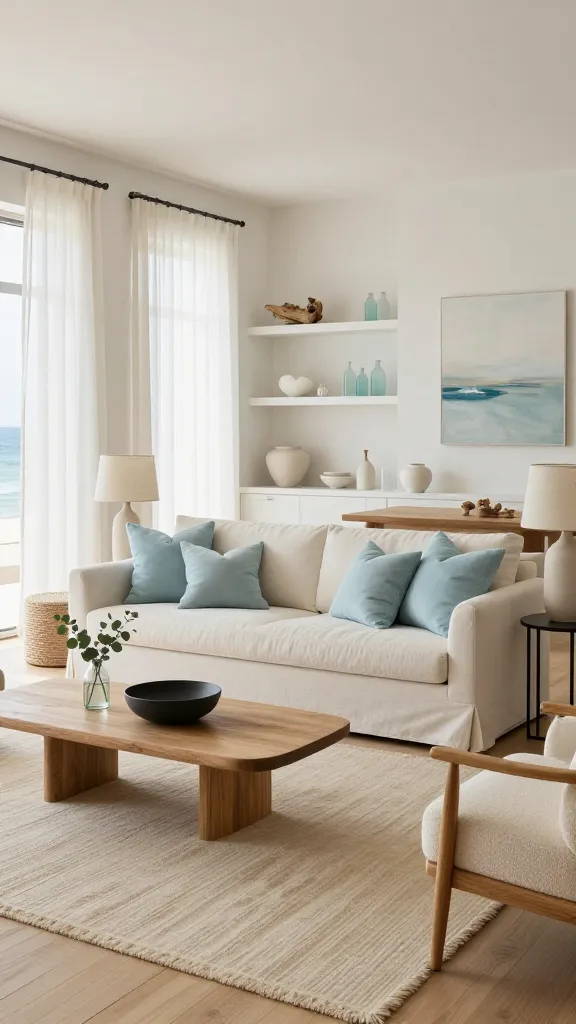
Imagine a breezy living room where sunlight bounces off pale walls and cushions feel like clouds. This scheme leans into serene neutrals and watery blues for an easygoing, vacation-house vibe. No seashell clichés here—just clean lines, soft textures, and the occasional rope detail that whispers coastal without yelling beach theme.
Color Palette
- Wall: warm soft white with a hint of cream
- Primary accents: muted sea glass blue and dusty aqua
- Grounding tones: sand beige, natural oak, and matte black details
Key Pieces
- Slipcovered linen sofa in warm white
- Natural oak coffee table with rounded edges
- Jute or sisal rug layered with a thin blue-striped cotton runner
- Matte black sconces to balance the light palette
- Ceramic table lamps in pale blue or white crackle glaze
Styling Tips
- Keep artwork simple: framed ocean abstracts or black-and-white shore photography.
- Mix linen, cotton, and basketweave textures so the room doesn’t feel flat.
- Add greenery—think olive tree or a rubber plant—for a soft, lived-in feel.
Use this if you crave calm and hate visual clutter. FYI, it also sells houses like hotcakes.
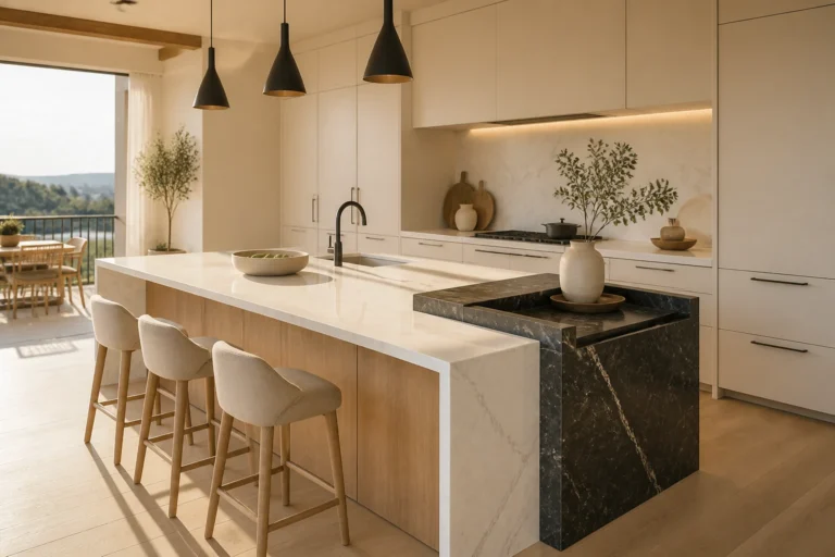
2. Elevated Neutrals: Greige, Charcoal, and Warm Metal Accents
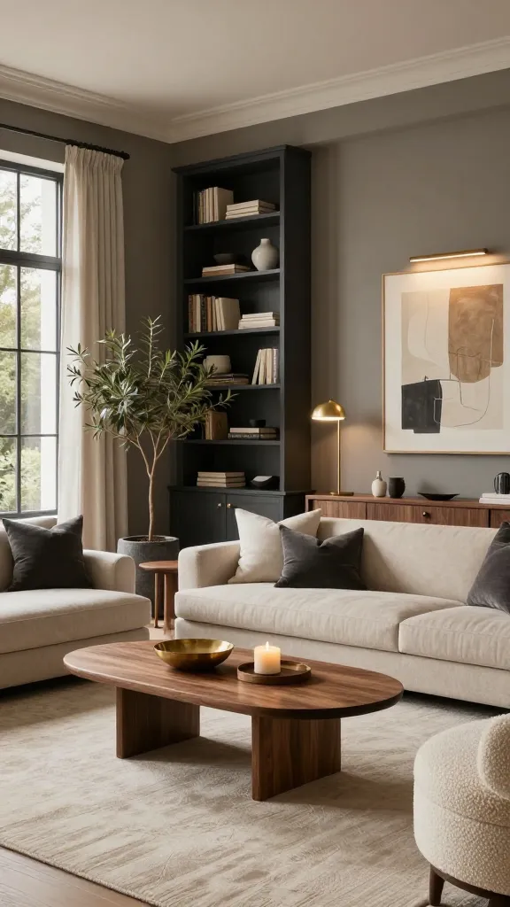
This is the grown-up, “I have my life together” palette. You get depth from charcoal, warmth from brass, and the world’s most flattering wall color: greige. It’s classic but never boring if you nail the textures.
Color Palette
- Wall: mid-tone greige (the lovechild of gray and beige)
- Secondary: charcoal for built-ins or an accent wall
- Accents: brushed brass, ivory, and warm walnut
Key Pieces
- Low-profile sofa in textured oatmeal
- Charcoal built-in bookcase or a media console with clean lines
- Walnut coffee table with a sculptural base
- Wool rug in ivory with subtle geometric pattern
- Brushed brass floor lamp and picture lights for ambient glow
Styling Tips
- Layer pillows: bouclé, suede, and linen in tonal shades.
- Use matte black frames for artwork to balance the brass.
- Introduce one unexpected texture—like a stone bowl or travertine pedestal.
Minimalists love this because it reads luxurious without screaming “look at me.” It works in apartments and big homes alike—seriously foolproof.
3. Jewel-Box Drama: Emerald, Sapphire, and Burnished Gold
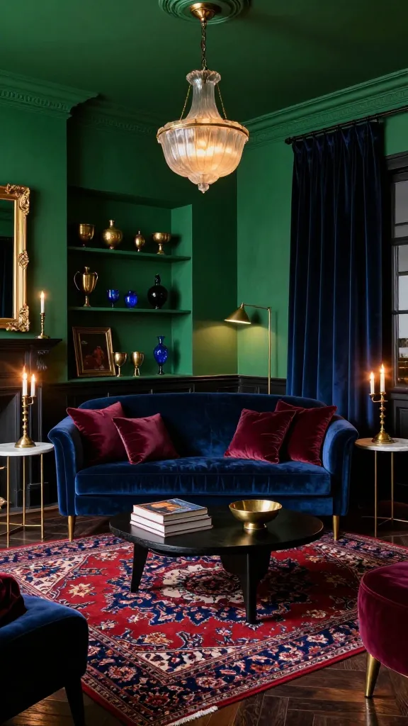
Want a room that doubles as a mood? Go rich and dramatic with deep jewel tones and metallic glow. This palette turns even a tiny den into a decadent hideaway.
Color Palette
- Wall: saturated emerald green or inky sapphire
- Secondary: oxblood or aubergine in small doses
- Accents: burnished gold, antique brass, and ebony wood
Key Pieces
- Velvet sofa in emerald or midnight blue
- Marble-topped side tables with gold or brass frames
- Persian-style rug with red and indigo threads
- Smoked glass pendant or chandelier for that moody sparkle
- Gilded mirror to bounce light and add glam
Styling Tips
- Paint the ceiling and trim the same color as the walls for an enveloping feel.
- Mix velvet, silk, and bouclé for rich contrast.
- Anchor with a black-stained credenza or piano-black lacquer piece.
This one’s for maximalists and late-night readers. If you love candlelight and vinyl records, welcome home.
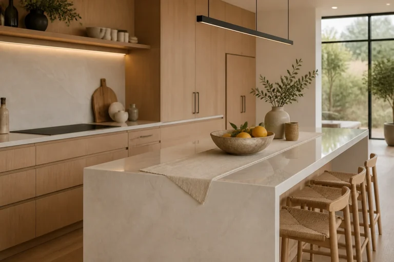
4. Earthy Modern: Terracotta, Olive, and Aged Bronze
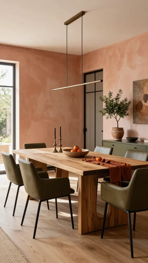
Grounded, warm, and wildly inviting—this scheme pairs sunbaked tones with organic textures. Think Mediterranean courtyard meets modern loft. It looks killer in dining rooms and kitchens where warmth matters.
Color Palette
- Wall: pale terracotta wash or warm putty
- Secondary: muted olive green and rust
- Accents: aged bronze, blackened steel, and raw oak
Key Pieces
- Plaster-finish walls or limewash for subtle movement
- Farmhouse trestle table in natural or smoked oak
- Olive leather dining chairs with slim black frames
- Earthenware vases and terracotta planters with herbs
- Bronze dome pendants over the table or island
Styling Tips
- Layer a flatweave kilim under the table for pattern and durability.
- Use linen runners and stoneware for everyday tablescapes.
- Bring in a fig tree or pothos for that lush, alive energy.
Choose this if you love cooking, hosting, and pretending every Sunday is a Tuscan lunch. IMO, it ages beautifully and hides kid mess like a champ.
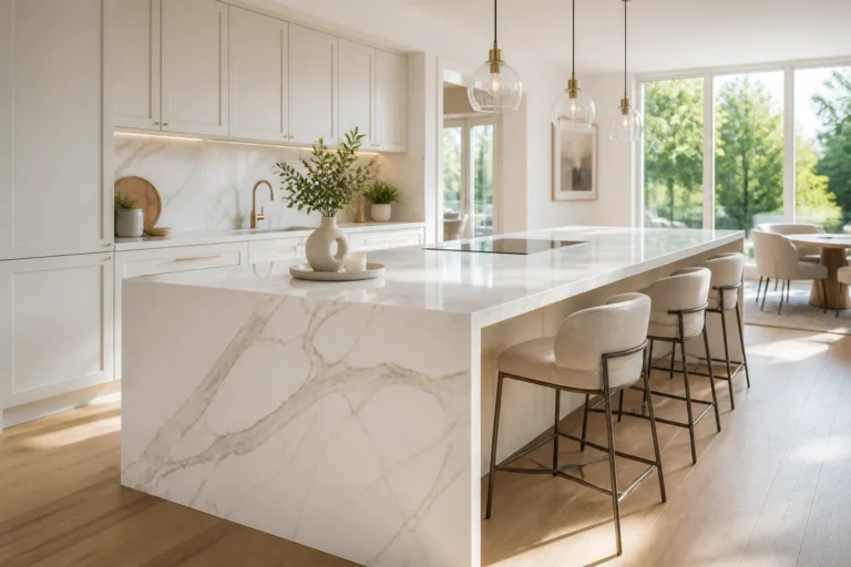
5. Monochrome Minimalist: Layered Whites With Soft Black and Natural Stone
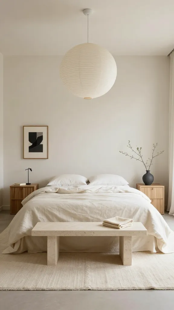
Clean, gallery-like, and surprisingly cozy when done right. This scheme layers warm whites and creams with honest materials. It’s restraint with a soul, not a sterile showroom.
Color Palette
- Wall: warm off-white with zero blue undertone
- Secondary: soft black or graphite for accents
- Materials: limestone, travertine, light oak, and textured plaster
Key Pieces
- Low, slipcovered bed in creamy linen
- Fluted nightstands in light oak or plaster finish
- Chunky wool rug in ivory
- Paper lantern pendant for soft, diffuse light
- Travertine side table or bench for natural variation
Styling Tips
- Keep contrast controlled: one or two soft black moments like a lamp or framed textile.
- Layer textiles: wool, linen, cotton matelassé.
- Hang one large-scale, neutral abstract to avoid visual clutter.
Perfect for small bedrooms and rentals where light matters. It’s calming, chic, and makes your morning coffee taste fancier—trust me.
6. Playful Color Pop: Warm White With Coral, Mustard, and Teal
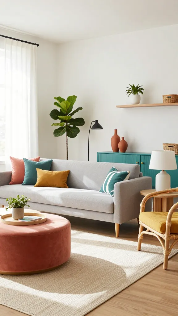
Crave energy without chaos? This cheerful palette delivers personality with just enough restraint. You’ll get happy color hits against a flexible, bright backdrop.
Color Palette
- Wall: clean warm white
- Primary pops: coral, mustard, and teal
- Neutrals: natural rattan, light maple, and matte white
Key Pieces
- Streamlined sofa in heathered light gray to ground the room
- Rattan accent chair with a mustard cushion
- Teal media cabinet or sideboard for a bigger statement
- Coral velvet ottoman that doubles as extra seating
- Graphic rug with a white base and playful pattern
Styling Tips
- Stick to a 60-30-10 balance: 60% white/neutrals, 30% wood/rattan, 10% color pops.
- Repeat each accent color at least three times in different scales.
- Choose playful art—bold prints, line drawings, or a neon sign if you’re feeling spicy.
Ideal for family rooms, playrooms, and anywhere you want joy without the circus. It’s modern, upbeat, and renters can pull it off with pillows and art alone.
There you have it—six color schemes that always hit the mark and never feel dated. Start with the palette that matches your mood, then layer textures and finishes until it feels like you. Rooms you love come from bold choices and good lighting, so pick a lane and go for it.