Let’s skip the guesswork and go straight to the good stuff. These seven room designs nail that sweet spot where color looks intentional, not loud. Each one gives you a clear palette, furniture picks, and styling tricks so you can copy with confidence. Ready to find your new favorite combo?
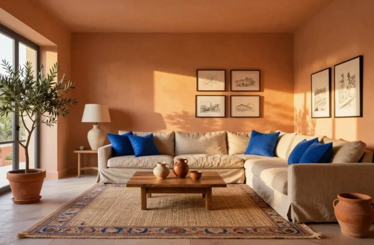
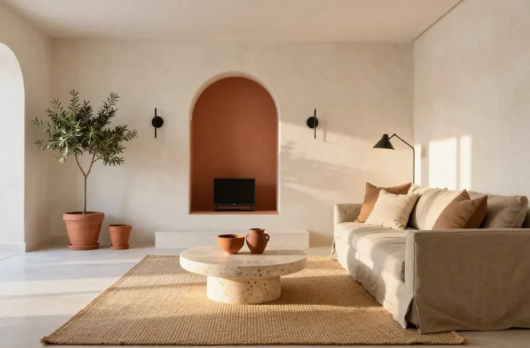
1. Sun-Washed Mediterranean Neutrals With Terracotta and Cobalt
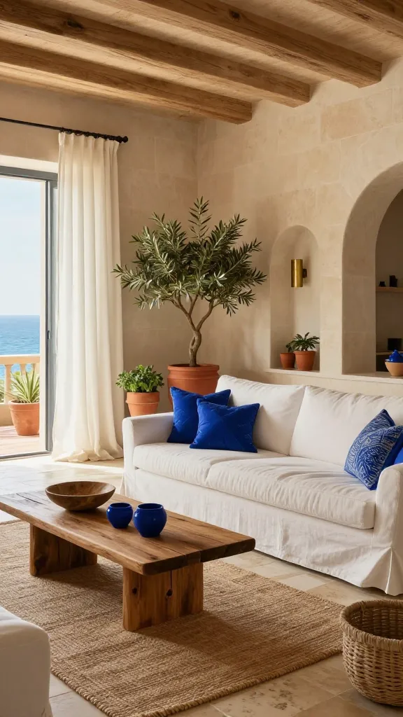
Imagine golden light bouncing off creamy walls while pops of ocean blue keep everything crisp. This look blends warm earth with breezy coastal energy. It feels like vacation without the overpriced airport snacks.
Color Palette
- Walls: Soft cream or warm white (think limestone)
- Accent Color: Cobalt blue on pottery, textiles, or a feature niche
- Base Neutrals: Terracotta, sand, driftwood brown
Key Pieces
- Linen slipcover sofa in warm white
- Terracotta planters with olive trees or herbs
- Woven jute rug and a rustic wooden coffee table
- Cobalt ceramic lamps and patterned ikat cushions
Styling Tips
- Use rough textures: limewash walls, clay vases, raw-edge linen.
- Keep metals matte: brushed brass or aged iron, not chrome.
- Hang a large indigo textile as wall art to ground the blue.
This vibe suits open-plan living rooms and sunny kitchens. You’ll love it if you want calm warmth with just enough color to feel alive.
2. Calm Scandinavian Pastels With Sage, Blush, and Charcoal
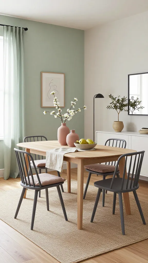
Soft, airy, and organized without feeling stiff, this design pairs barely-there pastels with grounding charcoal. Picture pale morning light and a room that whispers “breathe.” No, you don’t need to own a ceramic pour-over to qualify.
Color Palette
- Walls: Feather-light sage green or muted off-white
- Accents: Dusty blush and warm beige
- Anchor: Charcoal gray in thin lines and frames
Key Pieces
- Light oak dining table with minimalist lines
- Charcoal spindle-back chairs or slender metal dining chairs
- Paper lantern pendant for diffuse glow
- Wool flatweave rug in gray-beige
- Blush linen curtains or cushion covers
Styling Tips
- Stick to three wood tones max. Light oak dominates, walnut accents, no red undertones.
- Add a charcoal picture ledge for rotating art prints in blush and sage.
- Keep plants minimal: a single rubber plant or trailing pothos.
Perfect for dining rooms or work-from-home corners. If you crave peace but still want personality, this is your winner.
3. Sophisticated Monochrome With Cream, Espresso, and Brushed Brass
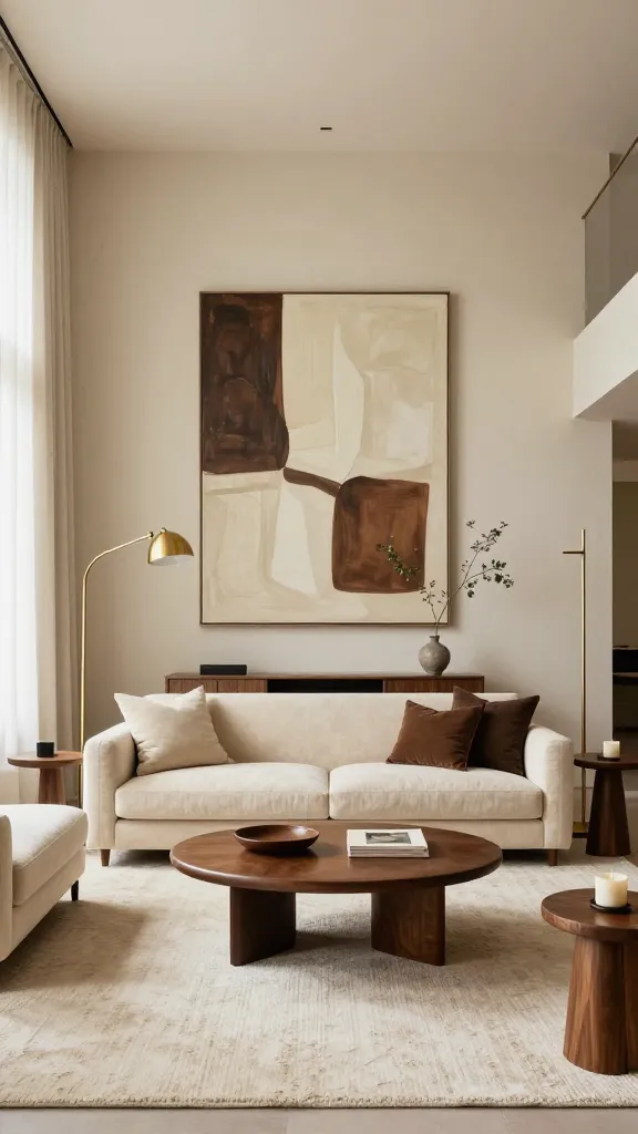
Think gallery-level chic without looking cold. Instead of high-contrast black and white, this scheme softens the edges with cream, deep espresso, and touches of warm metal. It’s elegant, not try-hard.
Color Palette
- Walls: Velvety cream (not stark white)
- Anchor: Espresso brown wood and leather
- Metal: Brushed brass, sparingly
Key Pieces
- Cream bouclé sofa or armchairs
- Espresso leather ottoman and walnut side tables
- Brass floor lamp with a slim profile
- Large-scale abstract art in cream and chocolate tones
- Textured wool rug in oatmeal
Styling Tips
- Layer textures: bouclé, nubby wool, smooth leather, stone coasters.
- Frame art in thin brass or dark wood for consistency.
- Swap black hardware for aged brass to warm the palette.
Use this for living rooms or primary bedrooms where you want luxe calm. IMO, it’s the most timeless of the bunch.
4. Fresh Botanical Contrast With Emerald, Mustard, and Crisp White
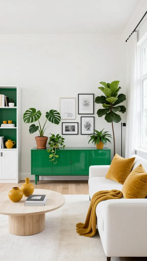
Bold, punchy, and ridiculously photogenic, this combo brings leafy energy indoors. The trick lies in clean white backdrops so the colors pop without chaos. It’s like a plant store and a modern gallery had a very charming baby.
Color Palette
- Walls: Bright white or soft gallery white
- Primary: Emerald green on a bookshelf, credenza, or accent wall
- Secondary: Mustard yellow textiles and ceramics
- Dark Accent: A touch of ink black in frames or hardware
Key Pieces
- Emerald lacquered cabinet or painted built-ins
- Mustard velvet cushions and a striped throw
- Natural oak bench with cane details
- Planters with monstera, fiddle leaf fig, and trailing ivy
- Black metal picture frames for structure
Styling Tips
- Repeat emerald three times: cabinet, planter, patterned rug detail.
- Balance mustard with neutrals so it punches, not shouts.
- Use botanical prints in black frames for a cohesive wall moment.
Great for entryways and dining nooks that need personality. If you love color but hate clutter, this one hits the mark.
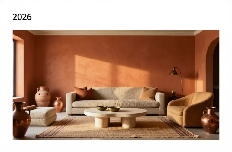
5. Earthy Modern Desert With Clay, Olive, and Ink
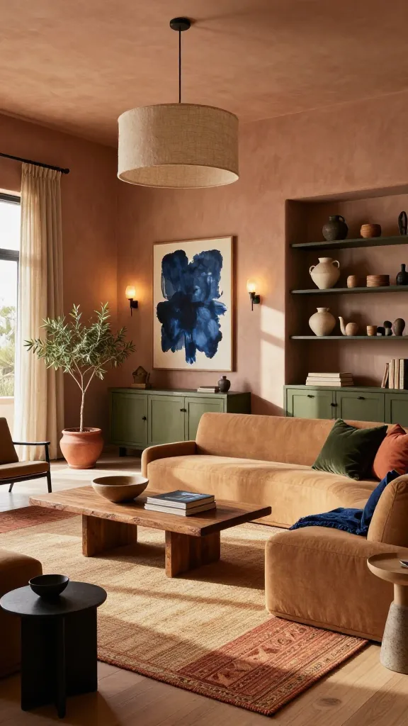
Grounded and moody without feeling heavy, this palette leans into sun-baked tones. Clay and olive carry the warmth, while inky accents sharpen the edges. It’s rugged, refined, and very “I found this at a small gallery.”
Color Palette
- Walls: Muted clay or taupe with pink undertones
- Secondary: Dusty olive green
- Accent: Ink blue-black for dramatic contrast
Key Pieces
- Low-profile sofa in sand or camel microfiber
- Olive cabinetry or a painted console
- Black iron sconces and a linen drum pendant
- Layered rugs: flatweave kilim over a jute base
- Stoneware vases in desert hues
Styling Tips
- Add a charcoal plaster fireplace or faux mantel for depth.
- Choose art with desert landscapes or minimal line drawings.
- Finish woods in matte, not glossy, to keep it organic.
Ideal for a den or reading room. You’ll adore it if you’re into cozy, textural spaces with a smidge of drama.
6. Coastal Black Tie With Navy, Soft Gray, and Polished Nickel
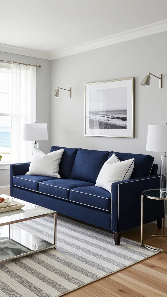
Classic coastal sometimes drifts into cliché. This version keeps the beachy calm but dresses it up with tailored lines and sleek finishes. Picture navy suits, sea breezes, and zero seashell kitsch.
Color Palette
- Walls: Airy soft gray or pale greige
- Primary: Deep navy blue
- Metal: Polished nickel or chrome for cool clarity
- Contrast: Bright white trims and ceiling
Key Pieces
- Navy upholstered bed or sofa with piping
- Pinstripe or herringbone rug in gray and white
- Nickel swing-arm sconces and lean glass lamps
- Lacquered white nightstands with nickel pulls
- Marine art or abstract navy brushstrokes
Styling Tips
- Repeat navy on two planes: upholstery and drapery or rug and art.
- Use sheer white curtains layered with tailored navy panels.
- Keep wood tones cool: ash or whitewashed oak.
Use it in bedrooms or formal living rooms that need polish. If you like structure with a breezy twist, this one delivers, trust me.
7. Playful Retro Pop With Coral, Teal, and Walnut
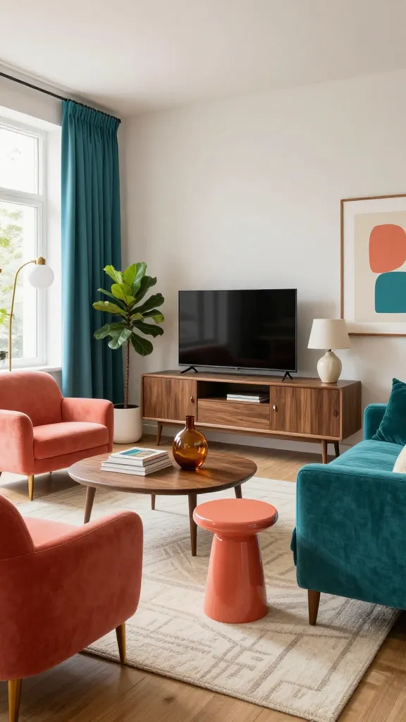
Joyful and a bit cheeky, this scheme nods to mid-century without going full time capsule. Coral brings the sunshine, teal cools it down, and walnut keeps it smart. Your space will feel like it knows how to host a great playlist.
Color Palette
- Walls: Warm white or pale greige
- Primary: Punchy coral on chairs or a statement wall
- Secondary: Saturated teal in textiles
- Anchor: Rich walnut wood
Key Pieces
- Walnut media console with clean mid-century legs
- Coral accent chairs or a lacquered side table
- Teal velvet curtains or a geometric rug
- Opal glass globe pendants in brass
- Graphic art prints with curved shapes and playful lines
Styling Tips
- Let walnut be the hero wood; keep other woods minimal.
- Mix patterns in the same color family: stripes, dots, and mod curves.
- Add a single mint or citron accent for a zippy twist, FYI.
Perfect for living rooms and creative studios. Choose it if you want energy, optimism, and a subtle retro wink without the avocado fridge.
Seven rooms, seven balanced color stories—no paint-store meltdown required. Start with the palette that matches your mood and build from there. Try a small swap first, then go big once you feel the happy vibes kicking in. Seriously, your home’s about to look very put together.